Reducing time per order 3x for a meal-prep service
About
Atlanta Meal Prep is a food prep and delivery service in the heart of Atlanta, USA.
Challenge
WordPress service designed by a graphic designer, which made UX cumbersome, slow, and somewhat limited.
Impact
I redesigned the service reducing order time completion by 300% and increased the ordering success rate 4x.
Team
- Client
- Me as the Product designer
- 1 BE engineer
- 1 FE engineer
- 1 Graphic Designer
My role
- User research & analysis
- UX and UI redesign
- Design library kit
- Usability testing
Timeline
October – December 2023
Order success rate increased
4x
Reduced time spent per order flow
300%
SUS score from 47.5 (F) to
82 (B)
Assessing UX before the redesign
Heuristic analysis outlining the key usability problems and improvement opportunities.
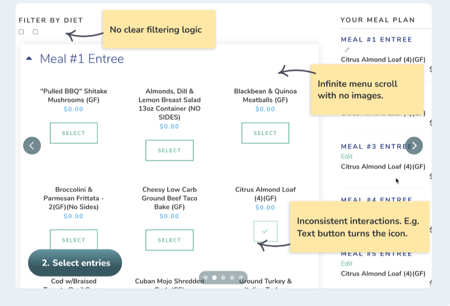
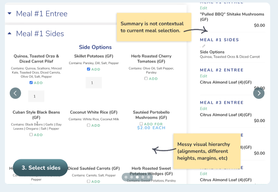
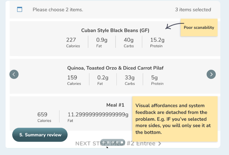
6 areas for improvements
Improve visual hierarchy
Redesign clunky scanning UX
Organize components into a design system
Change a hard-coded menu to a contextual flow
Add affordances and system feedback
Introduce missing features and loyalty
Exploring & designing
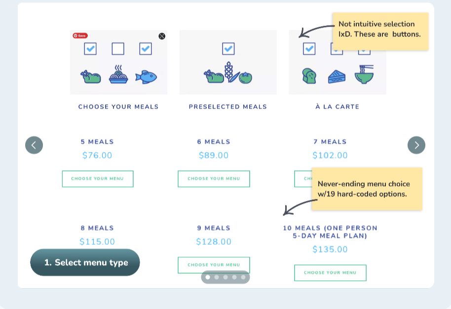
Challenge #1
Redesign a menu type selection. 19 hard-coded options to contextual flow.
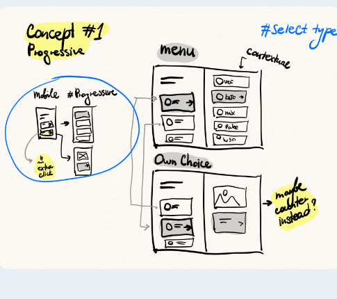
Layout
2 column progressive layout
Logic
Based on the menu type (weekly/custom), the customer sees different submenus.
Concept decision
I landed on a hybrid solution between concepts #1 and #4. Combining the convenience of progressive menu selection, but keeping submenu options in the same left column.
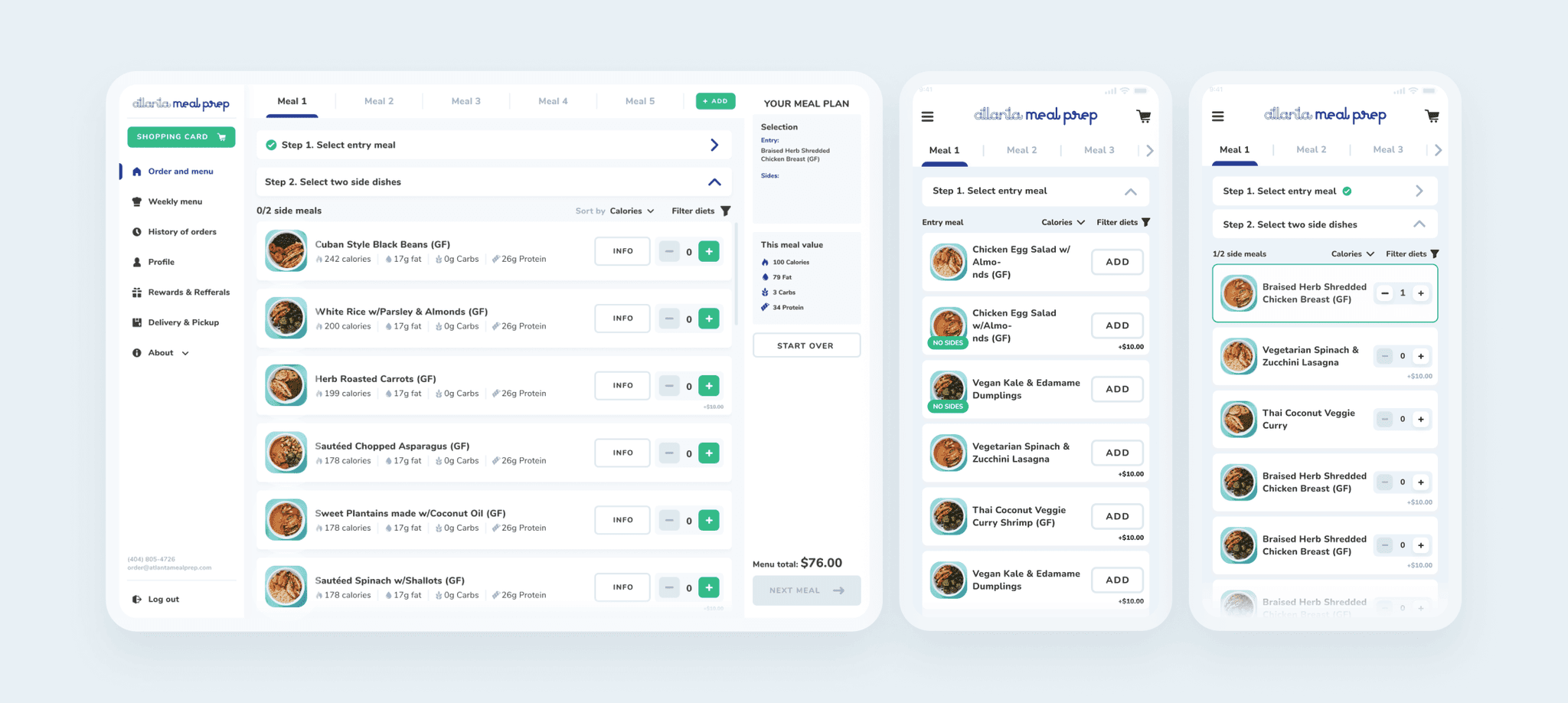
Challenge #2
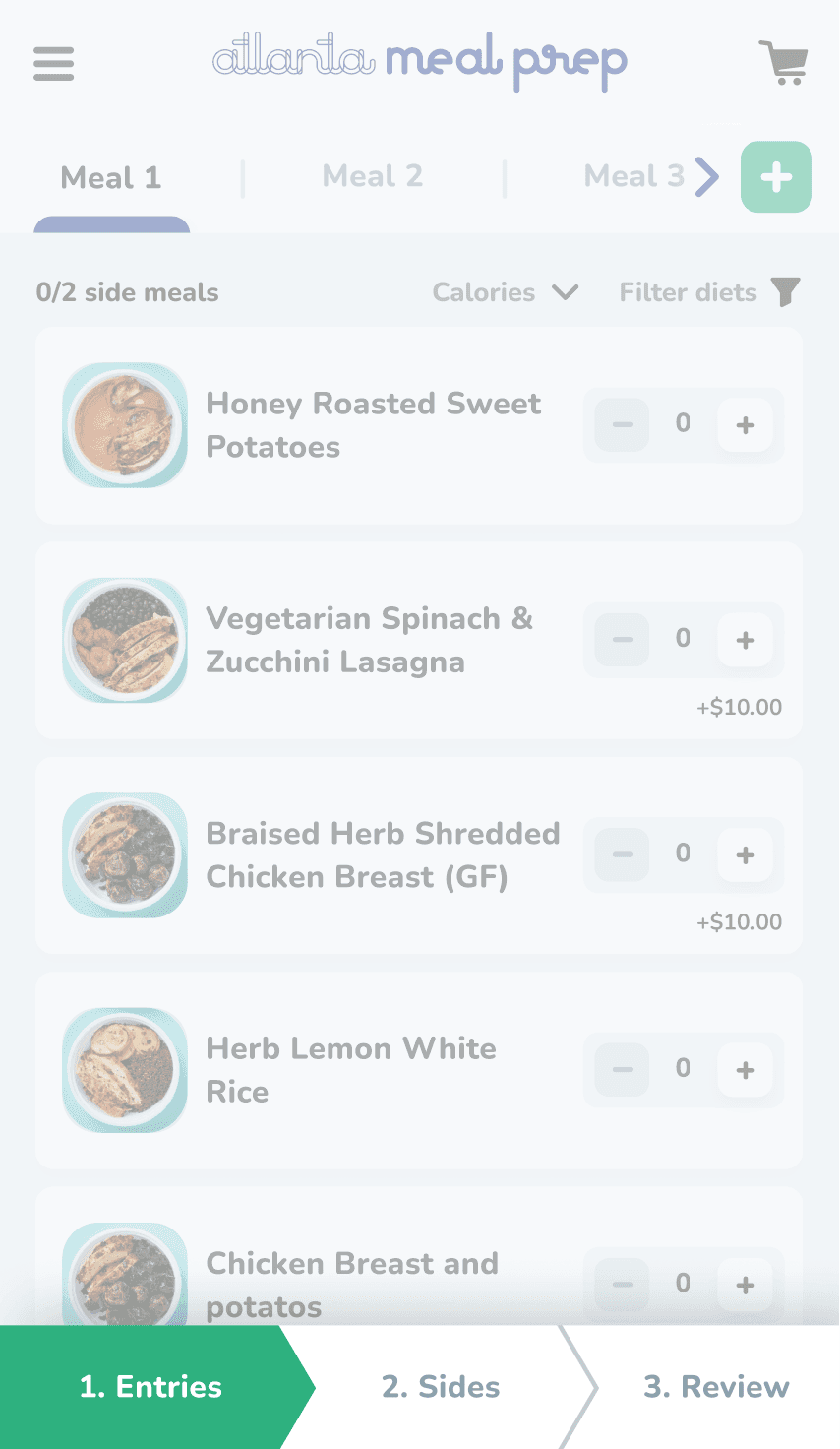
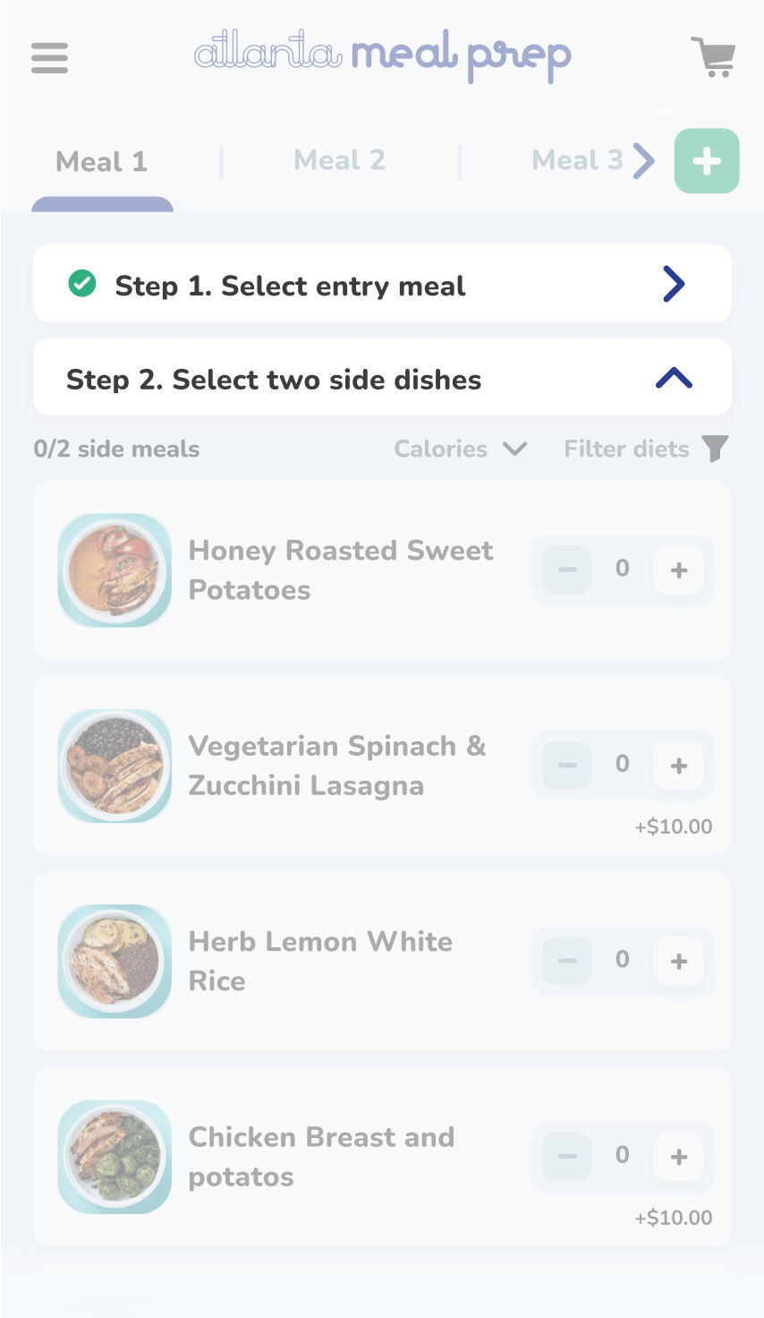
Redesign an order flow, keep the logic: 1 entry meal + 2 side dishes selection.
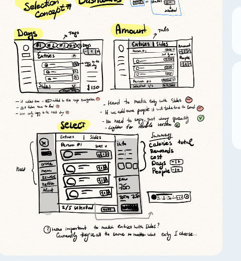
Layout
Top bar + 1 column + Summary
Logic
From a number of meals, guests land on 1 column centered content with accordions for entries/sides. Accordions collapse as soon as the right number of meals is selected.
Decision time
I chose concept #1 because switching tabs between entry meals and side dishes can feel disruptive.
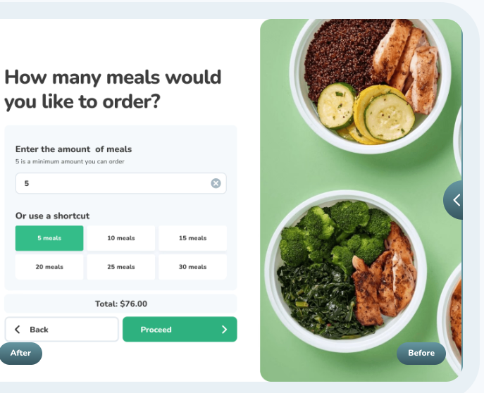
Before/After
Other design details
New features

Add-ons before checkout

Gift card

Loyalty program

Meals duplication
Unifying design library


Usability testing insights
Insight #1
A/B testing on mobile navigation
Context
I wasn't sure about mobile navigation patterns, choosing between bottom breadcrumbs and contextual accordions.
Solution
I threw an unmoderated prototype testing on 2 different groups of users.
Insight #2
Review meals before checkout
Context
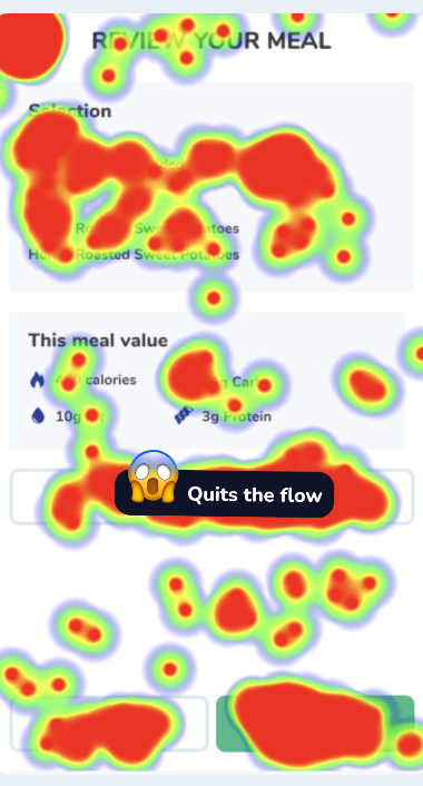
Heatmap data suggested that when users were asked to go back and edit their selection on mobile devices, this led to 40% errors.
Main issue
The start over button sounds ambiguous.
Insight #3
Duplication flow
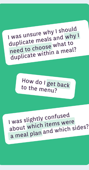
Users were confused why they have to select the menu items again.
Additionally it was visually not clear what is entry, what is side dish.
I've also noticed that people ignored the 'back' arrow on the header.
Results
SUS Before

SUS AFTER

But UX is never done…
This project was done 3 years ago and looking back here are the things I would love to improve today:
Improve accessibility
In 2023 I wasn't well-educated about accessibility. I wish I could improve it today.
Challenge interaction design choices
My eye for details developed quite a bit. I don't love some of the details and interaction design choices.
Add XL breakpoint
Adapting the design for an extra big screen and adding one more XL breakpoint. I don't love how far-stretched the menu items are.
Have detailed development specs
Developers were changing every week, so in 3 mo I had to partner up with 9 new developers. This taught me the importance of having detailed development specs to track interaction information and preserve knowledge even when people are constantly changing
Next project
All-in-one system for managing Dalkin's service providers
Dalkin • 2023